Data Visualization: Inducing Conclusions in the Shortest Time
Written by: Clay McNeff, Senior Consultant, Tableau Developer
As a Tableau developer, I’m always striving to better understand theory and best practices of data visualization. This often requires a multi-pronged approach, as the use of abstract pictures to represent numbers requires a combination of statistical, technical, and artistic skills. But if done correctly, data visualization can describe, explore, and summarize data sets in eye-opening ways.
In Edward R. Tufte’s book “The Visual Display of Quantitative Information”, the world’s leading analyst of graphic information provides one of his principles of graphical excellence, which is ‘… in the shortest time and with the least ink… give to the viewer the greatest number of ideas’. In this 3-part series, I hope to break down some of these key concepts and provide simple, powerful ways to execute them in your day-to-day visualization needs.
In part one of our Data Visualization Best Practices series, we’ll be talking about Tufte’s concept of inducing conclusions in the “shortest time”. There’s an oft-cited rule of thumb for dashboard design that suggests an end-user should need no more than 5 seconds to find the information she’s looking for when examining a dashboard. To accomplish this, the most important metrics need to immediately pop from the screen, draw the user in, and guide her through the rest of the dashboard.
To make sure I’m designing with this rule of thumb in mind, I always try to effectively communicate answers to the following 3 questions:
- What is the end-user seeing?
- Why should they care?
- What should they do next?
If an end-user can answer these 3 questions within the first 5 seconds of opening a dashboard, I have confidence that the dashboard is well designed. This doesn’t mean that I expect the user to only spend 5 seconds on the dashboard, as more detailed analyses demand more time, but I do expect them to fully understand the dashboard’s scope and its major data-driven takeaways almost immediately.
To get to that point, there must first be a clear understanding of requirements, goals, and expectations that are developed during the definition and planning stages of the build. But what about dashboard design? Are there any tools and tricks to guide the end-user more effectively through a dashboard? Of course! Let’s discuss a few…
- Tableau performed an eye-tracking study in 2017, and the biggest conclusion they drew is that BIG numbers matter. They found that dashboards with very large numbers showed a concentration of visual attention directly on the big number and that this attention happened very early in the viewing sequence. So, if you have an important number, make it big!
- Most cultures will start browsing from the upper left corner. If you want quick conclusions, place the most important graphs here, and find ways to seamlessly direct them to the next most important charts.
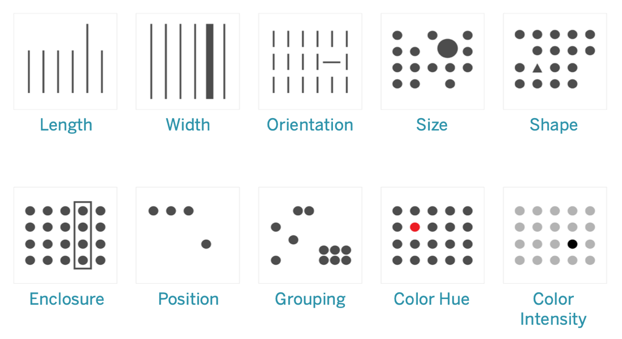
- Take advantage of pre-attentive visual properties. These are qualities of an image that can be processed without our conscious action and can lead to a quicker and better understanding of what is being presented. The below image presents examples of quick visual patterns that help our brains notice differences in data. Developers can capitalize on these properties to make data-driven conclusions happen that much faster.
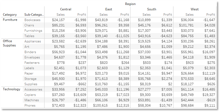
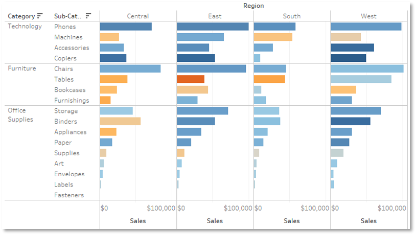
Let’s take a look at two of the same data sets in different set-ups.

Figure 1

Figure 2

Figure 1 is a text-based, tabular chart that doesn’t lead to any quick conclusions.
Figure 2 shows a new, improved version of Figure 1. There were a couple of quick design changes with some of these pre-attentive visual properties in mind. Specifically, I changed sales data from being text-based to being associated with bar length, and I placed profit on color.
These two visualizations provide the exact same data but in very different ways. When viewing the second visualization, notice how quickly you can start to tease out the data’s most important conclusions and begin asking subsequent questions of the data. For example…
- Despite tables being a top-5 sub-category with respect to sales, why does it have negative profit in all regions except the West?
- Why does the Central region have at least 7 subcategories with negative profit when no other region has more than 3?
- If we look to expand in the future, does it make sense to target the West or East since that’s where we’re seeing the most sales and profit?
All these conclusions were almost immediately noticeable by doing nothing more than capitalizing on pre-attentive visual properties. With so many chart types and customization options utilized by the top data visualization tools, including Tableau, key data points can be conveyed to stakeholders in a matter of milliseconds!
Looking for help bringing your data to life? Schedule a free consultation today.
P.S. We’re still offering Tableau Doctor Office Hours! If you’re working in Tableau and need help or feedback on your dashboard, sign up here.
