
Data Visualization: Inspiring the Greatest Number of Ideas
Written by: Clay McNeff, Senior Consultant, Tableau Developer
This is a continuation of our 3-part series on Data Visualization Best Practices, where we’re discussing one of Edward R. Tufte’s principles of graphical excellence, which is ‘… in the shortest time and with the least ink… give to the viewer the greatest number of ideas’.
To view part one on inducing conclusions in the “shortest time”, visit here.
To view part two on producing visualizations with the “least ink”, visit here.
In part three of our series, we’ll be talking about Tufte’s concept of inspiring the “greatest number of ideas”. How do we increase the number of ideas someone can have when interacting with our visualizations? After all, most of our designs are built upon defined requirements in which the key questions have already been identified. While this may be the case, we can still design a more efficient dashboard that not only answers these predetermined questions but also provides a tool that answers questions the end-user may not even know he has yet. I’m going to focus on three ways in which we can inspire the greatest number of ideas from our visualizations:
- make better use of the data-ink you already have
- make better use of the real estate you’ve been provided
- incorporate elements of interactivity the keep the end-user engaged
Make Better Use of the Data Ink You Have
We’ve already established that ink that doesn’t serve a distinct purpose should be removed from a visualization. We can take that a step further and suggest that ink should actually serve more than one graphical purpose when suitable. Graphical elements that serve multiple functions can effectively display much more complex data and provide users with tools that are capable of answering a wider array of questions.
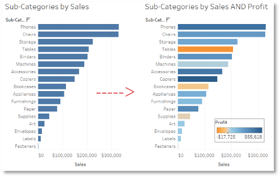
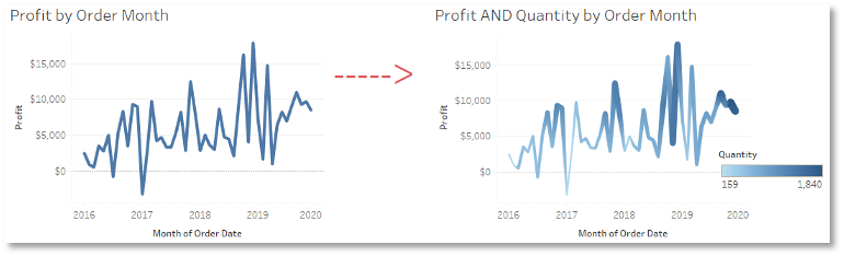
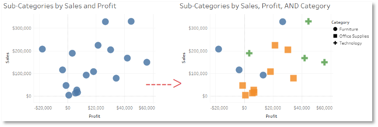
The question is “How?” The limitation we face in two-dimensional space is that we’re often confined to two-dimensional analysis, i.e. a bar chart that presents one quantitative measure across a set of qualitative “bars”, or a scatter plot that places dots at the intersection of two qualitative measures. These charts, while certainly valuable when telling a story, are a bit limited in that they really only tell one story. Reworking these charts and allowing other aspects of your data to drive color, size, and shape of your marks can deepen your understanding of the underlying data without adding more ink.
Examples:
Make Better Use of the Real Estate You’ve Been Provided
Some visualization tools are limited in that they can only display a certain level of complexity per chart. In order to provide an additional layer of information, you may feel inclined to create a second chart and ask the user to jump back and forth between the two. The downside of this approach is that each time the user breaks her eye line to shift to another chart, part of her focus is lost along the way and she may not be able to make the necessary connections between the two to maintain appropriate context. One way to engineer your way around this problem is to layer charts on top of one another to create some interesting, albeit complex, views.
Let’s say you have a request from someone wanting to know his monthly sales numbers compared to his $50,000 target. He seems to have 2 primary goals: first, to know how much time he’s spent over and under this goal, and second, to know to what degree the difference between his sales and his target had accumulated over time. You begin with a simple line chart and a $50,000 reference line, but this doesn’t really provide many quick, clear insights to either of his questions. See below.
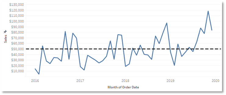
You could calculate the difference between his sales and his target and put it on a second graph, and perhaps calculate the percentage of the time he was above or below his target and put in on a third, but you start to lose focus while bouncing around all these visualizations. You’d find yourself capable of only answering very simple, one-dimensional questions, often without additional context from the other charts.
My eventual solution did incorporate multiple charts, but it layered them in a way where the eyes can stay focused in one space. See below.
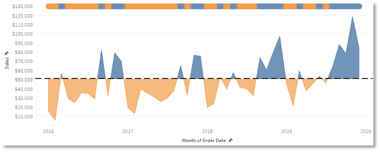
This visualization contains three separate charts, but they’ve been combined in a way that appears as if all are part of only a single chart. First, I converted the line chart to 2 area charts, one that’s colored blue for all marks above the $50,000 target, and one that’s colored orange for all marks below the same target. Area charts were chosen to better display an answer to his second question – to what degree does the difference between his sales and his target accumulate over time? They show a combination of how long, and to what degree, did he make or miss his target. A third line chart was added at the top of the visualization that strips out the degree to which he made or missed his target and does a better job of answering his first question – how much time did he spend over and under his goal? This layered chart provides clear answers to all his questions without ever asking the user to look elsewhere for more information.
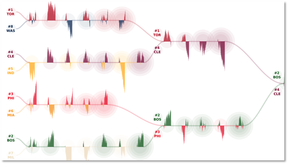
Another great example of chart layering is an example authored by Chris DeMartini and shared on Tableau Public. His analysis of the 2017-2018 NBA playoffs leverages a concept called small multiple flows, which combines a set of events, providing an intense data visualization about those events, while also connecting one event to the next via a flow element. His specific visualization features bar charts of individual plays depict individual game narrative, circle charts to show how many games a team had won in the series up to that point, and it’s all organized to reflect the playoff bracket format of the NBA playoffs.
Incorporate Elements of Interactivity to Keep the End-User Engaged
As data literacy continues to progress across all industries, we’re finding a continued push away from ad hoc analysis and towards self-service analytics. There’s an ever-growing need not for simple reports that serve a singular purpose for one person, but for analytic tools that can be leveraged across departments, if not entire organizations. As data visualization experts, we can do our part by promoting the interactive components of our dashboards that open them up to wider audiences.
One common way to promote interactivity is instead of designing a single dashboard for whoever is making the request, design a series of dashboards intent on highlighting the data at varying levels of granularity. Upper management may only want to see a certain month’s result, but lower management will need to know details. Individual analysts may need to go further and drill all the way into record-by-record data. Designing a series of dashboards that allows users to not only jump into the data at different levels of aggregation but then allows them to seemingly jump up or down these levels of aggregation with just a few clicks of a button, will help transition entire teams from slow, ad hoc analysts to more knowledgeable, self-servicing aces in no time.
Another design feature I leverage to promote interactivity and engagement within Tableau is the user-driven parameter. I use these to essentially swap out entire portions of a dashboard to fit different needs. A more modular design allows a user, even one with more general interest than defined questions, a sandbox in which he can interact with the data that matters most to him. In many of my designs, you’ll find dropdown boxes that allow the user to swap out metrics on the chart in front of him. In more complex cases where it’s not just a metric swap, but perhaps an entire chart type that needs to be changed, I’ll design my dashboard with a series of charts all occupying the same space, but the only one populates once the user defines what he wants to see. Tableau is smart enough to minimize unused space, so once a user defines the details he wants, the chart he wants appears before him and all others are minimized. By enforcing the greatest number of ideas, we can make data accessible and insightful for all types of audiences.
Looking for help bringing your data to life? Schedule a free consultation today.