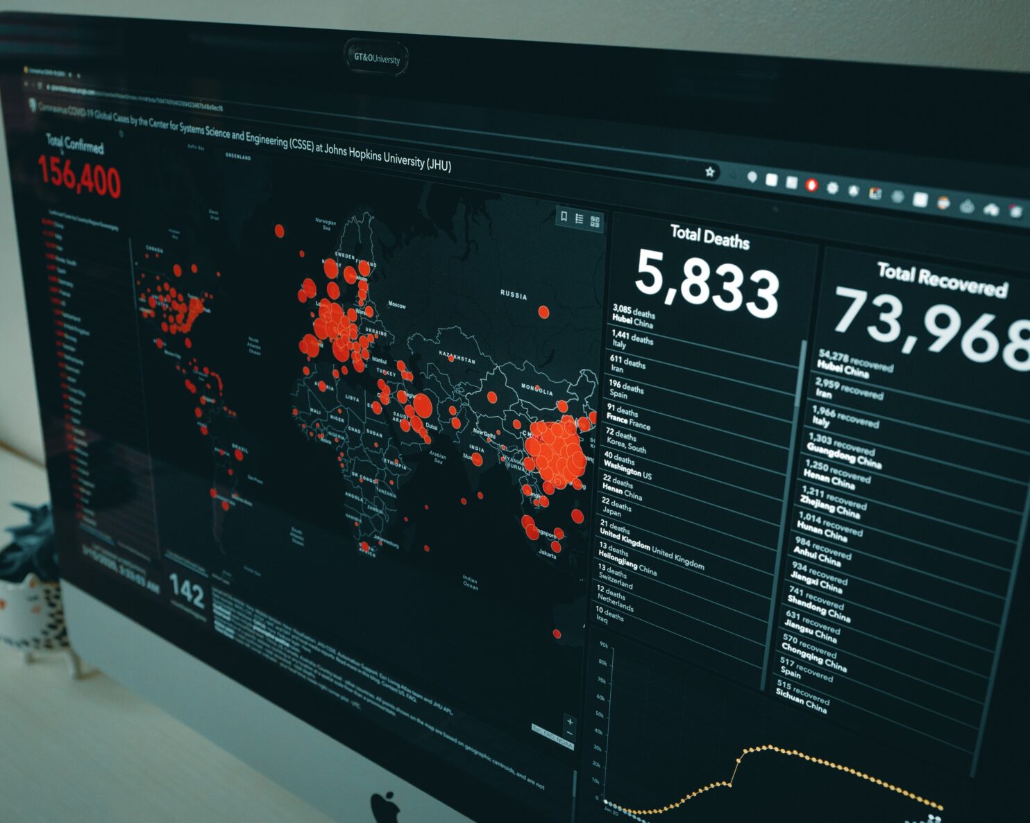
COVID-19 Data Visualizations
If you’ve looked at a map, graph, or chart regarding COVID-19 over the past month, chances are it was a data visualization. They are being shared all over the media and online. The many different visualizations prove to be an example that there’s no one-size-fits-all for visualizing data. Here, we’re sharing some of the visualizations we’ve been looking at.
TABLEAU’S COVID-19 DATA HUB
This data hub includes visualizations for nearly every situation you could imagine. They share their favorite Daily Dashboard, have featured Community Visualizations, and even have a “Global COVID-19 Starter Workbook” to jumpstart your own analysis. This all-encompassing hub is a great way to stay up to date with what’s happening.
Tableau is also offering free training for COVID-19 data! Their data hub has plenty of great information for getting started with data visualization. Take advantage of it while you can – you won’t regret it.
INFORMATION IS BEAUTIFUL
Information is Beautiful put out a COVID-19 #Coronavirus Infographic Datapack. It includes data visualizations on Infection Trajectory, Infection & Fatality Rates Vary by Country, Seriousness of Symptoms, Ages at Risk, and more. This source lives up to their name because their visualizations are, in fact, beautiful! They are easy to read, and all of their data sources are linked.
ISDH – INDIANA NOVEL CORONAVIRUS REPORT
A great source of information for anyone (especially in the United States) would be to check your local state government’s resource page. The Indiana COVID-19 Data Report has changed over the past weeks. At first, it included total positive cases, total death, total tested, and a county map. Since then, it has evolved to include information on ICU Bed Usage, Ventilator Usage, and Demographic Distributions for confirmed cases. Reports and visualizations may vary by state, but it’s a good place to start if you’re wondering how the virus is affecting your county.
There are plenty of ways (and visualizations) to stay informed during this pandemic. Data visualizations make information easy to comprehend and understand in a different way. We’ll continue to add to our list as more come up!
Looking to invest in data visualization for your business? Schedule a free consultation today.


