
Data Visualization: Producing Visuals with Less Ink
Written by: Clay McNeff, Senior Consultant, Tableau Developer
This is a continuation of our 3-part series on Data Visualization Best Practices, where we’re discussing one of Edward R. Tufte’s principles of graphical excellence, which is ‘… in the shortest time and with the least ink… give to the viewer the greatest number of ideas’. To view part one on inducing conclusions in the “shortest time”, visit here.
In part two of our series, we’ll be talking about Tufte’s concept of “less ink.” All elements of a visualization either support your point or distract from it. One way to improve visual clarity is to decrease distractions and remove portions of your graphics that don’t present new information. This concept is often measured by a metric called data-ink ratio, or the proportion of a visualization’s ink devoted to the non-redundant display of data-information. While the metric’s name seems to call back to a time when visualizations were kept simple in order to limit ink costs on printed mediums, the metric remains important today in order to keep visualizations as clear and effective as possible.
Redundant, expendable elements of a visualization can take the form of excessive grids, redundant labels, unnecessary decorations, etc. Just as a good editor prunes out unnecessary words, a good developer should prune out elements of a visualization that draw the attention away from what’s most important – the data.
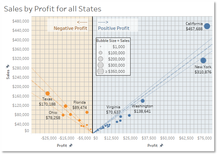
Figure 1
A few issues:
- The background grid overwhelms the data and only serves to distract the end user.
- The y-axis, bubble size, and data labels all provide the sum of sales data. This level of redundancy may give you some interesting visual effects, but it also muddies the visualization by introducing too much ink that fails to provide any new insights.
- The same can be said about the x-axis, background colors, profit-related text boxes, and bubble colors; all four of these features convey the same positive vs. negative profit information, likely suggesting that we don’t need all of them.
- Unless the audience is highly technical and cares about trendline confidence bands, single trend lines will likely suffice and use 67% less ink than the current design.
Let’s redesign it with a higher data-ink ratio:
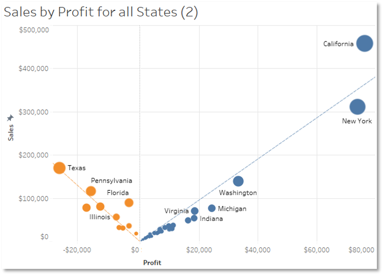
The gridlines have been reduced in number and darkness, redundant data labels, background colors, and text boxes have been removed, and trendlines have been simplified. As a result, we have a much simpler, cleaner graphic that will be much easier for the end-user to follow.
The most common complaint I receive with this approach is – what if someone wants more specific data point values and doesn’t want to estimate values from the less granular axis labels? For instance, I may be able to look above and estimate that California has a sum of sales near $460,000 but doing so requires me to interpolate between two grid lines that are $100,000 apart. What if this estimate isn’t close enough for my purposes? The good news is that many of these elements can be re-introduced in ways which don’t decrease the initial effectiveness of this graphic; they can be added to the tooltip that appears when you hover over a data point, or they can be made available in an adjacent graphic that serves as a drill-down from the parent graphic. These methods provide a valuable form of interactivity and self-service that works with, instead of working counter to, visualization effectiveness.
Looking for help bringing your data to life? Schedule a free consultation today.