
Using Data Visualization to Understand the Claims Appeals Process
BACKGROUND
A large financial services firm needed insight into the changes made to their claim appeal process. They wanted a fully automated dashboard to better understand how their appeals were trending YoY and MoM with the ability to interact and drill down.
CHALLENGE
A member of our client’s claims team manually updates a spreadsheet to track claim appeals. The spreadsheet was acting as a database that included appeals data for the last four years. Reporting didn’t exist making it impossible for claims leadership to see how appeals were trending if the changes to the process made a difference, or the ability to make data-driven decisions.
APPROACH
The CSpring team created a dashboard that’s automatically updated daily as new appeals are added to the file by the claims department.
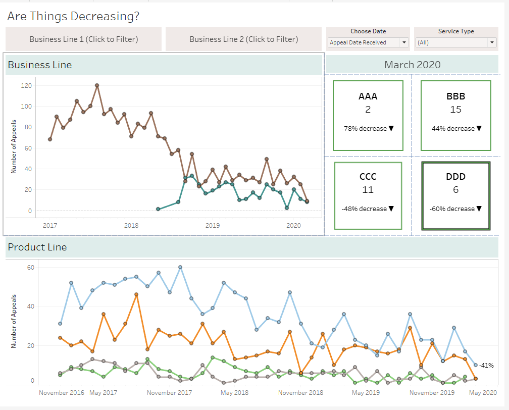
Stakeholders can interact and filter the dashboard in several different ways depending on their needs. For example, they have the ability to change between two dates – the date the appeal was received or the decision date for the appeal. At the request of claims leadership, the dashboard consisted of two line charts showing the trends specific for two lines of business and product lines within them.
It also included four important categories of appeals that show MoM increase (red) or decrease (green) that dynamically change color.
*Data has been altered to keep our client’s information private.

BENEFIT TO CLIENT
Our client went from having very limited knowledge of claims appeals to an automated and interactive dashboard providing them insight into processes and trends. This automated dashboard gives them the ability to make data-driven decisions for their business.
Need help creating data visualizations for your business? Send us a message and schedule your free consultation today.